
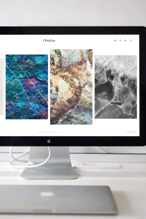
A visitor lands on your website and makes up their mind in a fraction of a second. Not about your prices or your experience, but about whether you seem like a real, capable business worth their attention. That judgement happens before they read a single sentence, and it rests almost entirely on how the page looks. These visual trust cues are a core part of effective website design, because appearance is the first argument your site ever makes.
Colour, typography and whitespace form an unspoken language. Used well, they tell a Perth customer that a business is organised, established and safe to deal with. Used carelessly, they raise doubt no amount of persuasive copy can undo.
How Colour Shapes Perception and Emotion
Colour carries meaning before it carries information. Cool blues and greens tend to read as calm and dependable, while warmer tones feel energetic or approachable. There’s no single “correct” palette, but there is a wrong way to use one: scattering too many competing colours across a page.
Restraint signals reliability. A tight palette of two or three core colours, used consistently, tells visitors you’ve made deliberate decisions. A clashing, rainbow-heavy site suggests the opposite. Local customers rarely articulate this, but they feel it. Consistency in colour reads as consistency in service.
The practical goal is coherence. Pick a primary colour, a supporting accent for buttons and highlights, and neutral shades for text and backgrounds. Then apply them the same way everywhere.
Typography as a Credibility Signal
Type does more than deliver words. The shapes of your letters influence how believable those words feel. Clean, legible fonts at a comfortable size suggest a business that respects the reader’s time. Cramped, ornate or hard-to-read type suggests carelessness, and carelessness erodes trust.
Hierarchy matters just as much as the fonts themselves. Clear differences between headings, subheadings and body text help visitors scan and understand a page at a glance. When everything looks the same weight and size, the eye has nowhere to land and the content feels flat.
A safe approach is to limit yourself to one or two typefaces: one for headings, one for body copy. Vary size and weight to create structure rather than adding more fonts. Readability should always win over decoration.
Whitespace as a Confidence Cue
Whitespace, the empty room around and between elements, is often mistaken for wasted space. In reality it’s one of the strongest signals of professionalism a page can send. Breathing room reduces cognitive load, letting visitors absorb one idea at a time.
Generous spacing communicates confidence. It says a business doesn’t need to cram every offer, banner and testimonial into view at once. Cluttered pages, by contrast, feel anxious and amateurish, as though the site is shouting over itself.
Whitespace also directs attention. Surround an important element with space and the eye goes straight to it. Crowd it and it disappears into the noise.
How the Three Work Together
These elements rarely act alone. A calm palette, readable type and ample spacing reinforce one another to create a consistent, recognisable feel across every page. That consistency is what builds a brand impression in the visitor’s memory.
When a homepage, service page and contact page all share the same colours, fonts and spacing rhythm, the site feels like one coherent business rather than a collection of mismatched pages. This visual continuity quietly reassures visitors that they’re in safe hands throughout. It’s worth remembering that these aesthetic choices work alongside the more functional side of a site; even a beautiful page struggles if a slow-loading page frustrates visitors before the design gets a chance to work.
Common Visual Trust-Killers
Certain habits make a service website look untrustworthy no matter how good the underlying business is. Watch for these:
- Too many colours competing for attention with no clear hierarchy
- Multiple decorative fonts that clash or strain the eyes
- Text jammed edge to edge with no breathing room
- Low contrast between text and background, making copy hard to read
- Inconsistent styling from one page to the next
- Stretched or low-resolution images that look pixelated
Any one of these plants a small seed of doubt. Several together tell a visitor to look elsewhere.
Auditing Your Own Site
You don’t need design training to spot problems. Work through your pages with a critical eye:
- List every colour that appears. If it’s more than three or four core shades, tighten it.
- Count your fonts. Two is usually plenty; more than that needs justification.
- Check spacing. Does content have room to breathe, or does it feel packed?
- Read your body text on a phone and a desktop. Is it comfortable, or do you squint?
- Click through several pages in a row. Do they feel like the same business?
Small, consistent fixes here often make a page feel dramatically more professional without changing a word of the content.
Turning Trust Into Momentum
Once colour, typography and whitespace have earned a visitor’s trust, that goodwill needs somewhere to go. A polished, credible page is only half the job; the same visual momentum that built confidence should now steer the eye toward an obvious next move. That’s where guiding visitors toward a clear next step becomes the deciding factor between a page that merely impresses and one that actually turns interest into enquiries.